
A graphic design portfolio is essential for showcasing your work to potential clients and employers.
The PDF file format ensures your portfolio remains consistent across all devices, making it a preferred choice for many designers.
In this article, we provide 10 inspiring graphic design PDF portfolio examples and tips to create your own online portfolio. We discuss the advantages of using PDF and how to convert an existing portfolio into PDF using PDF Reader Pro software.
Whether you're a seasoned designer or just starting out, these examples and tutorials will help you create an eye-catching and shareable professional PDF portfolio.
10 Graphic Design Portfolio Examples
1. Emily Lai: Graphic Design Student Portfolio

Image source: Pinterest
This graphic design portfolio showcases Emily's student work. The purpose of her portfolio is for potential employers or clients to get a glimpse of her design process and style.
The portfolio also comprises a variety of design projects; from product design and marketing to magazine layout and painting. As a student entering the graphic design market, it's important to show the various skills she has attained at university and what she can offer.
Cleverly utilizing white space, the minimalistic layout and colors of her portfolio emphasize her designs and give a uniform feel to her portfolio.
How to Emulate Emily's Style
-
Color Scheme: Use a limited color palette with a primary color for the background and a contrasting color for the text. In this case, it's a green and off-white combination.
-
Typography: Choose a bold, sans-serif font for headings and a simple, readable font for body text. The use of a consistent font family with different weights can help maintain visual coherence.
-
Layout: Organize the content in clearly defined sections with headings. Use a grid or columns to align text and visual elements neatly.
-
Graphics and Icons: Utilize clean, flat-design icons for each section. In the example, icons are used for technical skills and language proficiency.
-
Cultural Elements: Incorporate elements that reflect personal culture or identity, as seen here with the inclusion of Chinese characters.
2. Pham Hai-Linh: UI and Graphic Designer Portfolio

Image source: Pinterest
Pham Hai-Linh, or Hi-Linh, is a young graphic designer with some industry experience. Her portfolio shows off her education and work experience. She has worked at one company since achieving her Bachelor's Degree in Design, but she's also been expanding her skillset to Motion Graphics and UI Design.
As a designer who has started your career path, it's important to emphasize the work experience you've gained and how you've developed your skills further.
If you want to grow into a particular graphic design niche, such as UI design, you can use your portfolio to show how you've prepared for this specialization.
Graphic design studios and agencies aren't only looking for impressive designs but also for progressive, goal-oriented individuals who are self-motivated learners.
How to Emulate Hi-Linh's Style
-
Bold Typography and Color: Use a bold and playful typeface for the name or headline to grab attention. Employ a contrasting color scheme, such as blue and white, to make elements stand out.
-
Personal Branding: Create a unique logo or symbol that represents your personal brand, as seen with the distinctive pen nib and linkage design next to the name.
-
Clean Layout with Icons: Organize the information in a clean, grid-based layout with plenty of white space. Use icons to represent different sections like education, interests, and contact information, making the content visually engaging and easy to navigate.
-
Visual Hierarchy: Establish a clear visual hierarchy by using different font sizes and colors to differentiate between headings and subtext. This helps guide the reader through the resume.
-
Skill Illustrations: Present skills and software proficiency with both text and related icons, allowing for quick visual communication of your capabilities.
3. João Victor Mota Alexandrino: Scholarship, Internship, and Freelance Design Portfolio

Image source: Pinterest
João is an urban architectural designer interested in product design, audiovisual, sketching, and diagrammatical drawing. He lists all these interests in a visually appealing infographic style. He incorporates blue ink on pink paper, which references his architectural background (a blueprint).
This approach not only showcases his areas of expertise but also gives his potential educational organization or customer a foretaste of his design style.
He pulls through this quirkiness with an unconventional portfolio layout, using icons and numbers to communicate his various skills visually. João's portfolio illustrates his mastery of visual communication and serves as a conversation starter when applying to educational institutions and freelance projects.
How to Emulate João's Style
-
Isometric Illustration: Include an isometric illustration that represents your profession or workspace. This adds a unique visual element that can make your portfolio stand out.
-
Monochromatic Color Scheme with Accent: Adopt a monochromatic color scheme for the background and most elements, using an accent color to highlight important details or categories.
-
Infographic Style: Use an infographic approach to display information. Employ icons and graphics to represent skills, interests, and experiences, and use bars or charts to visually denote proficiency levels.
-
Organized Blocks of Information: Structure the content in blocks or sections that are aligned in a grid. This helps organize the information hierarchically and makes it more digestible.
-
Typography: Utilize a combination of bold, modern typography for headers and a simpler, clean font for body text. Keep the typography consistent with the design's overall geometric and structured theme.
4. Claire Perelli: Personal Branding Portfolio

Image source: Pinterest
This well-educated graphic designer took a unique approach to show potential clients her creativity. Claire, alias Ddudujam, used her illustration skills to reframe the A4 page, placing a drawing of herself floating in an imaginary world and holding up her resume.
Using blue and yellow colors to create a stark contrast, Claire showcases her drawing skills, education, interests, languages, and design software competencies in this graphic design portfolio.
She also lists links to the social media platforms where potential clients or employers can find more of her work, namely Behance and Instagram.
How to Emulate Claire's Style
-
Hand-Drawn Illustrations: Incorporate hand-drawn illustrations that reflect your interests or field of work. These should be whimsical and artistic, giving a very personal touch to the portfolio.
-
Illustrative Personal Branding: Use a hand-drawn portrait or a personalized logo. Claire Perelli's portfolio features an illustrative self-portrait, which gives it a unique and artistic flair.
-
Limited Color Palette: Choose a limited color palette with one or two colors, plus white, to create a strong visual impact. This portfolio uses blue and yellow on a white background, creating a stark contrast that draws attention.
-
Creative Typography: Experiment with typography by using a mix of hand-lettering or custom fonts for headers to add character, alongside more readable fonts for other text.
-
Clear Section Headings: Despite the artistic elements, maintain clear and organized sections with bold headings for Education, Languages, Skills, etc., to make the information easy to find.
5. Frank Chimero: Senior Graphic Designer Portfolio

Image source: Pinterest
In this graphic design portfolio example, we see a senior designer with over 20 years' experience showcasing his work. Using a basic, minimal layout with a simple illustration and sans-serif font, Frank emphasizes a design philosophy of 'quality over quantity.'
With many years of design experience in branding, digital products, and print design, it could be difficult to decide what to include in one's portfolio. Frank includes:
- His core capabilities or design skills
- The major brands he's worked with, including Nike, Microsoft, and Starbucks
- His contact details
- His website to find more information
How to Emulate Frank's Style
-
Minimalist Aesthetic: Embrace a minimalist design with a lot of white space and a clean layout. This allows the content and few design elements to really stand out.
-
Line Art Illustration: Incorporate a line art illustration, like the one of Frank, that adds personality and a human touch without overwhelming the design.
-
Subtle Color Palette: Use a subtle color palette with neutral tones, perhaps a single color for the illustration and text, to maintain a professional and sleek look.
-
Organized Content: Structure the information in well-defined sections. In this portfolio, the text is divided into clear sections such as "About Frank," "Capabilities," and "Select Clients."
-
Typography: Choose a simple and elegant typeface, and play with different font weights to create hierarchy and interest. The use of all caps for headings and a more restrained style for body text can be effective.
6. Alexander Ray Boren: Freelance Graphic Designer and Illustrator Portfolio

Image source: Pinterest
This freelance portfolio places the graphic designer and illustrator himself in the middle of the page. Using colorful progress bars and a retro style, Alexander's portfolio reads like an infographic showing his 'vital signs.'
With graphic design and illustration being his two main disciplines, he showcases his skills in particular types of design: branding, web design, print, character design, rendering, etc. He also emphasizes his proficiency in various design software and computer operating systems.
At the bottom of his online design portfolio, prospective clients can see the logos of major brands he's worked with in the past: Samsung, Lenovo, etc. They can also phone him, email him, scan a QR code at the top of the page, or click on his website URL to see his work.
How to Emulate Alexander's Style
-
Photo Integration: Use a full-body photograph of yourself as a central element, blending it into the background with a neutral color overlay to create a seamless look.
-
Infographic-Style Elements: Represent your skills and competencies using infographic elements such as bar graphs. This visual representation makes the information engaging and easy to digest at a glance.
-
Subtle Background: The background should be muted with a subtle texture or pattern that does not overpower the content. The use of a vintage or sepia tone can add a classic feel.
-
Colorful Accents: Use color selectively to highlight important areas such as skill levels and focus areas. This adds visual interest and helps organize the content.
-
Clear Section Dividers: Organize the resume by clear sections – skills, work experience, software proficiency, etc. – and use different icons or boxes to delineate these areas.
7. Manuel Diaz Delgado: Motion Designer Portfolio

Image source: Pinterest
As a digital designer, Manuel has specialized in motion graphics; a branch of graphic design that uses sophisticated animations to tell a story. Motion graphics are most often used in the film industry, but brands also utilize motion graphics for a wide range of applications: advertising, websites, digital products, etc.
Manuel has a unique skill set, including proficiency in a range of design and animation software: Adobe Photoshop, After Effects, Illustrator, Premier Pro, Davinci Resolve, and Cinema 4D.
He used the portfolio format cleverly to look like a design software interface, complete with sine waves, form fields, and an animation timeline. This "animation timeline" lets future clients see Manuel's education and previous work experiences based on the real timeline of his life.
How to Emulate Manuel's Style
-
Dark Theme with High Contrast: The dark background with vibrant color accents provides a modern and sleek appearance. It helps the information pop out and is kind on the eyes, especially for digital viewing.
-
Use of Software Skill Indicators: Software proficiency is displayed using progress bars with the respective application icons, making it easy to assess skill level at a glance. This is a clever use of familiar visual elements from software interfaces that resonate with the design community.
-
Graphical Timeline for Experience: Instead of a traditional list, work experience is shown as a horizontal timeline, with colorful blocks representing different positions. This interactive approach is particularly suitable for showing the progression of a career over time.
-
Integration of Personal Photo: Like the previous examples, a professional headshot is included but with a darker overlay to blend with the overall theme. This suggests a focus on professionalism.
-
Inclusion of Additional Skills and Interests: Beyond professional capabilities, this resume includes a section for language skills and personal interests, each represented by an icon. This personal touch can make the resume more relatable and give a more complete picture of the individual.
8. Hye-In: Packaging Design Portfolio

Image source: Pinterest
This designer breaks out of the standard format of graphic design portfolios, placing their resume content on a cutout for a paper cube. The 3D package design adds playfulness, inviting potential employers or clients to cut out and paste the resume into a three-dimensional format.
Hye-In also uses retro graphics and colors to attract interest. The graphic designer also included a few unique elements to their PDF portfolio:
- A custom 3D drawing of the greeting "Hi," which contains the first letters of the designer's name
- A graph showing their personality traits
- A list of their licenses and prizes
How to Emulate Hye-In's Style
-
Geometric Shapes and Patterns: The resume features a distinctive hexagonal and 3D geometric pattern. Emulating this design would involve using similar shapes and patterns that create a sense of dimensionality and structure.
-
Color Palette: A cohesive color palette with complementary colors is used throughout the resume. The colors are bold yet harmonious, creating a vibrant visual appeal.
-
Graphical Layout: The content is organized within the geometric shapes, which serve as containers for text and graphics. The layout is non-linear and visually driven, inviting the viewer to navigate through the sections in a unique way.
-
Infographics for Skills: Program skills are presented using software icons and a graphical approach to display proficiency. This infographic style allows for quick assessment of skill levels.
-
Personal Branding: A large, stylized monogram or personal logo is prominently placed, which acts as a strong visual centerpiece. The use of a tagline or introduction like "HI I AM HYE IN" immediately establishes a personal brand.
9. Jesrina N: Hand-Made Digital Portfolio

Image source: Pinterest
Jesrina is a young designer who adds a tactile feeling to her creative portfolio by first making it by hand and then scanning it in. Some of the portfolio elements are digital designs, blending physical and digital design together.
The PDF file format is perfect for this unique design process, enabling the designer to use paper-based stationery to create a digital file.
This design approach hearkens back to the early years of graphic design, where design projects were made by hand and photographed using special equipment.
The designer emphasizes her personal style and creative process in this fun portfolio. It includes crumpled paper, colorful stickers, a custom ID card, and a bit of humor. As she doesn't have much work experience, she emphasizes her wide skill set obtained while studying: motion graphics, promotional design, brand identity, editorial design, UI/UX design, and packaging.
She also added simple icons displaying the software she uses and her proficiency in them.
How to Emulate Jesrina's Style
-
Layered and Textured Design: The resume has a collage-like aesthetic, using a mix of textures and visual elements that appear to be layered on top of each other, much like a scrapbook.
-
Use of Bold Graphics and Stickers: Incorporate sticker-like graphics to highlight areas of expertise. This creates a dynamic, engaging look that draws the eye to key competencies.
-
Creative Presentation of Personal Information: Model the look of an ID card for the personal section to add a novel twist to standard information presentation.
-
Graphical Skill Indicators: Use icons and varying sizes of boxes to visually indicate software skills. This infographic approach allows for an at-a-glance assessment of proficiency.
-
Unconventional Typography: The use of diverse fonts and typographical treatments adds to the casual, creative feel. This could include handwriting fonts or varying sizes and orientations of type.
10. Chu Mai Huong: Trendy Graphic Design Portfolio

Image source: Pinterest
Using a minimal, clean design with retro graphics and fonts, Chu Mai Huong shows potential clients that she's up-to-date with graphic design trends. This is especially important because she lists social media design as part of her core range of skills, which often requires knowledge of current events and trends.
This young designer is well-educated, having studied business and graphic design. She's also worked at a few companies, gaining experience and overcoming a few design challenges.
Another highlight of Chu's online portfolio is that she lists her personal skills, such as teamwork and time management. These skills stand out in bright-colored sticker designs.
How to Emulate Chu Mai Huong's Style
-
Color Palette: The resume uses a vibrant color palette that is consistent throughout the document, giving it a lively and energetic feel.
-
Iconography: The use of icons for both technical and personal skills makes the resume visually interesting and allows for quick comprehension of the candidate's abilities.
-
Personal Photo: Including a casual, friendly photo can make the resume feel more personal and approachable.
-
Informal Tone: The introduction uses an informal and conversational tone, which can make the candidate seem more relatable.
-
Border and Shapes: A dotted border and the use of shapes for different sections add to the playful nature of the CV while helping to keep content organized.
Creating Your Own Graphic Design PDF Portfolio
Do you want to build an impressive curriculum vitae that stands out from the pile? Try approaching your creative portfolio as a design challenge and ask yourself these questions:
- Are you creating a portfolio as an individual or creative agency?
- Who is your target audience, and what information are they most interested in?
- What would you like to communicate with your portfolio?
- Are you focusing on your education, work experience, breadth of skill, or a selection of specific, polished design pieces you're most proud of?
- What is the best format for the type of content you want to include in your portfolio, and how would you share it?
These questions will help you make foundational design choices about the look and feel of your graphic design portfolio.
Here are some practical steps to put an effective design portfolio together:
1. Document Your Design Projects
Choose the types of projects that not only reflect your best work but also showcase a range of skills and styles. Include works that received positive feedback or had a significant impact in the marketplace.
Try to incorporate a variety of work that spans different aspects of graphic design, such as branding, digital design, print materials, etc.
2. Arrange and Categorize Your Projects
Group similar projects together to provide a coherent narrative. This makes it easier for potential employers or clients to understand your versatility and areas of expertise.
We recommend tailoring the categories to reflect the kind of work you do. If you specialize in certain areas, make sure they are prominently featured. Don't try to show every single project you have ever worked on – curate your selection to draw a developmental narrative.
3. Design the Portfolio Layout
It's important to maintain a consistent style throughout the portfolio. This includes using a cohesive color scheme, typography, and layout design.
Keeping the portfolio design simple ensures that your work takes center stage, so try to keep the color scheme, design details, and imagery minimal.
Utilizing whitespace effectively will give each page 'breathing space' and ensure it doesn't feel cluttered or rushed.
Include interactive elements in your PDF, like clickable links, especially if you have online work to showcase.
4. Add Descriptions
If space allows, adding brief explanations can be beneficial. Mention each project's goals, challenges, and solutions, paying close attention to client deliverables (if applicable). This provides context and shows your problem-solving skills.
Clarify your role in each project, especially if it was collaborative.
5. Convert Your Digital Portfolio to PDF
Converting your digital portfolio to PDF will make it widely shareable and compatible with different devices and browsers.
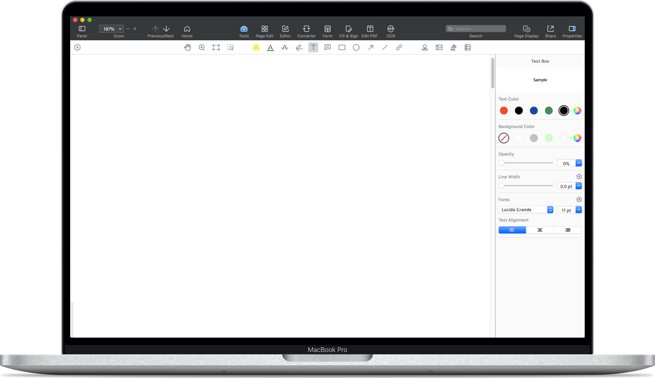
PDF Reader Pro is a robust PDF editing tool that can help you convert your design files into a sleek, professional PDF portfolio. Follow these steps to create a versatile PDF portfolio:
- Download and install PDF Reader Pro.
- Open the software and navigate to the File menu item, then select Create > From File or Create PDF.
- Browse and select your design files or your pre-compiled portfolio file.
- Click Open to create your PDF portfolio. You can customize it further if necessary using the helpful PDF editing tools available on the platform.
- Save your changes and share your PDF.

Navigate, edit, and
convert PDFs like a Pro
with PDF Reader Pro
Easily customize PDFs: Edit text, images,
pages, and annotations with ease.
Advanced PDF conversion: Supports
multi-format document processing with OCR.
Seamless workflow on Mac,
Windows, iOS, and Android.
6. Use a Readymade Portfolio Template
If you are short on time and need to submit a high number of applications, we recommend using one of PDF Reader Pro's readymade portfolio templates. Check out our collection below.


Creating a graphic design PDF portfolio is a reflective and strategic process. It represents you as a designer, so ensure it is well-curated and professionally presented.
By following the above steps and leveraging a tool like PDF Reader Pro, you are well on your way to making a lasting impression on potential clients or employers.


 Support Chat